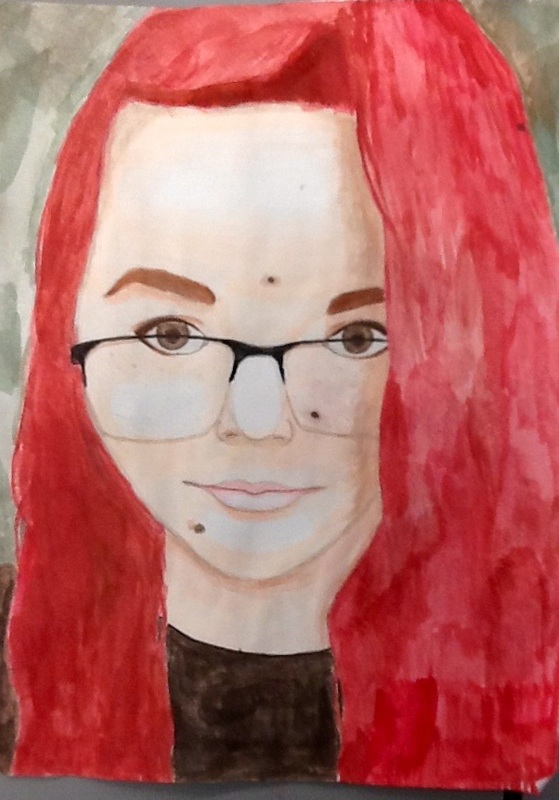
This is a self portrait painting using watercolor. One new skill was using complementary colors to make the image stand out more. The main art elements used were value and color. Value helped define edges and were used to differentiate the shades and highlights instead of using solid line. Color is tied in with value, as I'm using darker and lighter shades of color in order to create the shade and effect that makes the fact look more round rather than flat. This is a still painting that doesn't really create a mood but rather is like a picture of what I look like.
This is a watercolor painting of a macro still life. The subject matter is a lace pumpkin with a background that complements the main color. One new skill used in this assignment was using complementary colors to improve the overall quality. The main art elements are value, color and texture. Value helps with the texture; I had to use different shades of orange to emphasize the lace on the pumpkin and give it depth. This also ties in with color, as I mixed many different shades of orange and used a complementary color to emphasize the orange. This is a very still painting that gives the idea of a snapshot. There's not a lot of movement or flow.
|